September 3, 2026
Application Landscape Diagrams: Mapping What You Actually Run

Two failure modes account for most unusable application landscape diagrams. Either they include so much that nobody can read them, or they were accurate months ago and nobody has checked since.
Both problems have the same root. The diagram gets treated as a drawing exercise when it is really a scoping decision followed by a maintenance commitment. Get the scope wrong, and the picture is too dense for the meeting it was made for. Get the upkeep wrong, and you get something worse: a picture that still looks authoritative while describing an estate that no longer exists. This guide covers what belongs on the diagram, what to leave off, and how to build one in an order that holds up in a real portfolio. Then it gets to why the hand-drawn version decays the moment you save it.
What Is an Application Landscape Diagram?
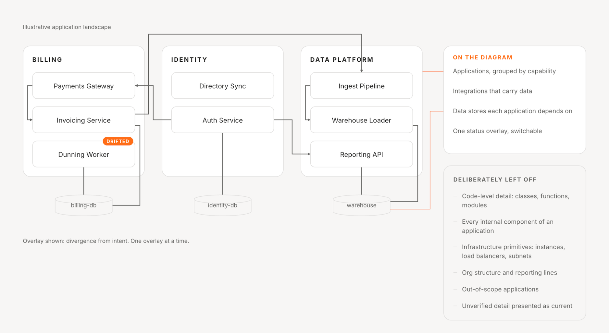
An application landscape diagram maps the applications an organization runs, grouped by business domain or capability, showing how they connect to each other and to the data they depend on. Its job is to answer portfolio-level questions: what do we run, what talks to what, and what breaks if this goes away.
That is a different altitude from an application architecture diagram, which describes the internals of one system, and we worked through it in our guide to system architecture. Graphs, hierarchy, and layout shape what a reader can take in, the subject of our piece on architecture diagrams.
How It Differs From a C4 System Landscape Diagram
C4 has a diagram type with a confusingly similar name. It defines its system landscape diagram as “a map of the software systems within the chosen scope,” where the scope is an enterprise, organization, or department. Its primary elements are the people and software systems within that scope, and C4 notes that, in practice, it is a system context diagram without a focus on one system.
The shapes are close; the difference is emphasis. C4’s version is people-and-systems oriented and sits above technology detail, while an application landscape diagram carries portfolio metadata on the same boxes: lifecycle status, ownership, cost, risk. If your team already uses C4 notation, you need overlays more than a second diagram type.
What an Application Landscape Diagram Should Include
Four things belong on it, and not much else.
Applications, grouped by business capability or domain. A flat list of ninety applications is an inventory; the same ninety grouped under Billing, Identity, Fulfillment, and Data Platform is a map. Groups let a reader ignore three quarters of the picture and still find what they came for.
Integrations, drawn as connections between applications. These are the expensive part to maintain and the easiest to drop when a diagram gets crowded. Hidden integrations can turn an apparently isolated application migration into a wider change.
The data stores each application depends on. Databases, warehouses, queues, and caches, at the level of “this application reads from that store.” Not schemas.
One or two overlays of status metadata. Lifecycle stage, business criticality, cost band, or a drift indicator. One at a time, switchable, instead of five encoded at once in color, border style, icon, and label until the diagram needs a legend to read its legend.
What to Leave Off
Most guidance here is about rendering, so it is worth naming which kind of exclusion we mean. The well-covered version asks how to draw thousands of nodes and edges without a mess. Grouping, filtering, and hiding lines at low zoom are the standard answers, and they work. We built two of them into our own Infrastructure View: a filter that hides component types, and a focus mode that dims everything outside a selection while keeping context visible.
The less-covered question comes first: which things should never become nodes at all. Rendering reduces what you display; scoping decides what enters the model. Six things that usually should not:
Code-level detail. Classes, functions, modules, and internal services belong to a system diagram. If a reader can see a class name, the altitude is wrong.
Every internal component of an application. The application is the node; its internals belong on a system diagram the landscape can point to.
Infrastructure primitives, unless infrastructure is the question. Individual instances, load balancers, and subnets change constantly and rarely change a portfolio answer. They belong in a separate infrastructure view, which answers a different question on the same model.
Org structure as boxes. Ownership matters, but it is an overlay on an application, not a shape on the canvas. The moment reporting lines become nodes, the diagram turns political and stops being honest.
Applications outside the scope this diagram was drawn to answer. The test here is materiality, not integration. An unintegrated HRIS or departmental CRM still carries implications for capability coverage, cost, ownership, and redundancy. AWS’s guidance on application portfolio management treats a complete, accurate inventory, with metadata down to licensing and annual cost, as the ground the exercise stands on. Exclude what falls outside the domains in scope, or what is too small to move a portfolio decision, not what has no line running to it.
Detail you cannot keep current. Keep material applications visible, but mark uncertain metadata and dependencies for validation rather than presenting them as current.
That last one bridges to the real problem: not what you draw, but how long it stays true.
Why Teams Build Them
Three uses justify the effort, and they decide how much precision the diagram needs.
Impact Analysis Before a Change
Somebody proposes retiring or moving an application, and the question is what else is affected. Accurate integration lines answer that from the picture. Without them, it becomes a round of asking people who may no longer be on the team.
Finding Redundancy
Duplicate applications rarely announce themselves. Different teams bought them under different names to solve the same problem, and grouping by capability makes two entries visible in one box. This is where the diagram feeds into application portfolio management, the discipline that decides what to do about it.
Modernization Planning
Sequencing depends on dependency order, which is what the diagram encodes. This is where a stale diagram does the most damage, because the plan gets built on it and the error surfaces after commitments are made.
How to Build One
Five steps, in this order. The order matters more than the tooling.
- Define the capability groups first, before listing any applications. Groups drawn afterward describe your org chart. Groups drawn first describe the business.
- Inventory the applications and give each one a primary group. One primary grouping keeps the picture legible. Where an application serves several capabilities, as identity, payments, and reporting usually do, carry the secondary relationships as tags or an alternate view rather than splitting it in two.
- Capture integrations, starting with the ones that carry data. Point-to-point first, then anything routed through a bus or gateway, so the picture reflects real coupling rather than intended topology.
- Attach ownership and lifecycle status as metadata, not as geometry. Fields on the node, so you can switch overlays later without redrawing anything.
- Decide explicitly how each element will stay current. Which parts a person updates, which parts come from a system, and how you will find out when either is wrong.
Step five is the one teams skip, and it decides whether the diagram survives the quarter:
The pattern is the argument: the rows a human should own encode judgment, and the rows that decay describe fact.
The Problem With Drawing It by Hand
Static tools are fine, and the honest limitation is narrower than a blanket “diagrams are bad” verdict. A drawing in a general-purpose diagramming tool or an ArchiMate-based EA suite is good for a one-time snapshot, an executive readout, or a future state that cannot be observed yet.
The limitation is upkeep at scale. A diagram drawn by hand records what someone believed on the day they drew it, and it starts drifting the moment it is saved. That is the failure we built Stacks against.
The damage is that the drift is invisible. A stale diagram renders as confidently as a current one, gets used in a planning meeting, and the gap surfaces during delivery. People start keeping their own notes, and the organization ends up holding several disagreeing pictures.
A Live Model Instead of a Drawing
The alternative is to derive the picture from the systems rather than maintain it alongside them. That is why we built Stacks, which is not a diagramming tool. It is our live model of your architecture as it runs, and the constraint set every recommendation, design, and answer gets checked against. The views map your subscribed integrations into that model rather than being drawn.
Our Infrastructure View and Architecture Inventory answer two specific questions underneath the application landscape: how infrastructure connects, and which components exist. Our broader Architecture Knowledge Base also connects business objectives and product constraints with software and infrastructure evidence. Functional diagrams help explain what the system does, while the portfolio landscape organizes that understanding around the business capabilities you need to assess.
The division of work matters. We supply architecture evidence to help you investigate application boundaries and dependencies. Your team still validates capability assignments, ownership, and lifecycle decisions against business context. Views refresh as new integration data is ingested, so the evidence does not depend solely on someone remembering to redraw it.
Underneath sits a physical-first modeling choice. We argued in our write-up on modeling AWS infrastructure that VPC-centric visualizations tuck Availability Zones inside like footnotes, hiding what shares a physical fate and where security boundaries blur. Stacks anchors on Availability Zones and replicates logical VPCs within them, so failure domains and performance paths stay legible.
The limits belong here rather than in a footnote. Our analysis is bounded by the sources and context you provide, and a model missing a whole class of systems produces confident recommendations with a blind spot rather than obviously broken ones. Keep that apart from the exclusions above: a scoping decision is one you made and can name, while a coverage gap is one you have not noticed. The physical-first example here is specifically about AWS. We also engage teams with other cloud and hybrid estates, so confirm which sources can represent your environment instead of assuming this example establishes complete coverage.
Application Landscape Diagram vs. Related Diagram Types
These four types get confused constantly, and you can tell them apart by the question each answers.
If you are choosing between formats more broadly, our guide to architecture diagram types works through the wider set.
Getting Started
The fastest way to find out whether your diagram is worth keeping is to test it. Pick an application you know changed last quarter, find it on the diagram, and check whether its integrations and data stores match what is deployed.
If they match, you have a working process, and the next step is scoping: cut what does not earn its place. If they don’t match, the problem isn’t the drawing. The picture and the system have no mechanism connecting them, and redrawing will not fix that. Our Architecture IDE closes that connection for the factual layer, and the judgment layer stays where it belongs.
Book a demo to explore the infrastructure evidence behind your application landscape.
Share this Post