August 14, 2026
Architecture Diagrams: Types, Best Practices & Tools

Architecture diagrams lie. Not intentionally, but the moment you finish drawing one, it starts drifting from reality. Services get added, dependencies shift, infrastructure scales, and that well-crafted diagram you shared in Confluence last quarter? It now describes a system that no longer exists.
That gap between what a diagram shows and what's actually running is the central tension of architecture diagramming. Architecture diagrams are practical visual representations for communicating how software systems work, aligning development teams around shared mental models, and making informed technical decisions. Yet the static nature of traditional diagrams means they're perpetually out of date. The teams that treat architecture diagrams as living artifacts, not finished deliverables, tend to make better decisions faster.
This guide covers the core types of architecture diagrams every software architect and enterprise architect should know, what makes an architectural diagram effective, how to draw an architecture diagram from scratch, and how modern architecture diagram software is closing the gap between what your diagrams show and how your system works in production. Whether you're documenting a greenfield microservices architecture platform or rationalizing a post-acquisition technology estate, the principles here apply.
What Is an Architecture Diagram?
An architecture diagram is a visual representation of a software system's structure, showing its system components, the relationships between them, and how data flows through the entire system. It serves as a visual framework and shared reference point for developers, architects, project managers, and business stakeholders to understand, plan, and communicate system design decisions.
That definition covers the basics. Beyond serving as visual aids, though, architecture diagrams are doing two jobs at once: they describe what exists (documentation), and they communicate intent (software design). A deployment diagram that shows your Kubernetes cluster topology serves as documentation, while a proposed microservices decomposition that your team is debating in a design review is really about design communication. The best diagrams manage to do both at once.
Architecture Diagrams vs. System Diagrams vs. UML Diagrams
These terms get used interchangeably, but they mean different things.
Architectural diagrams show the high-level overview of a system: major components, their responsibilities, and how they interact. They're opinionated about what to include and what to leave out, because their purpose is communication, not completeness.
System diagrams are broader. They can include hardware, network topology, external systems, and physical infrastructure alongside software components. A system architecture diagram is a specific type that combines both views to visually represent the entire system.
UML diagrams follow a formal specification maintained by the Object Management Group (OMG). UML defines a formal set of diagram types across structural and behavioral categories, with strict notation rules. UML is precise and standardized, but many teams find it heavyweight for day-to-day communication. The C4 model, created by Simon Brown, emerged as a lighter alternative that organizes architecture views into four levels: Context, Container, Component, and Code.
In practice, most teams use a blend. They borrow UML notation where it helps (sequence diagrams for API flows, component diagrams for service boundaries) and use informal box-and-arrow diagrams where formality adds friction.
Why Architecture Diagrams Matter
A system without architecture diagrams is a system where technical knowledge lives exclusively in people's heads. That works until someone leaves, a new engineer joins, or a critical decision needs to be made under time pressure.
Improved Collaboration Across Teams
Communication architecture diagrams give distributed teams a shared visual language. When a backend engineer in Berlin and a DevOps engineer in Austin are discussing a deployment pipeline, a diagram removes ambiguity that text-based descriptions leave open. It transforms "the service talks to the database" into a specific, reviewable claim about which service, which database, over which protocol, through which network boundary.
This matters for cross-functional communication too. Product managers, project managers, security reviewers, and technical stakeholders all need to understand system structure, but at different levels of abstraction. A well-structured set of architecture diagrams, from high-level context maps down to component-level detail, gives each audience the technical details they need. The benefits of architecture diagrams compound when the whole organization can access them. Teams that invest in unified architecture visibility spend less time reconciling fragmented, siloed views of the system and more time making decisions about it.
Better Architecture Decision-Making
Every architecture decision in the software development lifecycle carries trade-offs: cost vs. performance, simplicity vs. flexibility, speed of delivery vs. long-term maintainability. Diagrams make these trade-offs visible. When you can see that adding a caching layer introduces a new failure mode between your API gateway and your primary datastore, the conversation shifts from abstract to concrete.
Diagrams also create a historical record. Comparing your architecture from six months ago to today reveals patterns: growing complexity in one area, successful simplification in another, and dependencies that were supposed to be temporary but became permanent.
Reducing Risk in Complex Systems
In distributed systems, failures cascade. A single misconfigured load balancer can take down services three hops away. Architecture diagrams help teams identify potential bottlenecks and blast radius risks before they become incidents.
Security reviews depend on architecture diagrams to identify trust boundaries, data classification zones, and authentication flows, the same elements the OWASP Application Security Verification Standard's architecture and threat modeling requirements call for documenting and justifying. Without a current diagram, that review is guesswork.
Types of Architecture Diagrams
Not every diagram serves the same purpose. The type you choose depends on what question you're trying to answer: "How does data flow through our system?" calls for a different diagram than "What infrastructure do we need to provision?"
Software Architecture Diagram
Software architecture diagrams show the major individual components of a system and how they interact. Think of them as detailed blueprints for the code-level structure in software engineering: services, libraries, frameworks, APIs, and the contracts between them.
These diagrams are most useful during the design process and design reviews, when evaluating whether a proposed architecture meets non-functional requirements like future scalability, testability, and maintainability. The C4 model's Container and Component levels map directly to this type.
System Architecture Diagram
System architecture diagrams zoom out further to visualize system components across both software and infrastructure: servers, load balancers, databases, message queues, CDNs, and the network topology connecting various components. This is the diagram your operations team cares about.
For teams running cloud architecture in AWS, Azure, or GCP, cloud architecture diagrams typically use the cloud provider's official icon sets to represent managed cloud services. The AWS Architecture Center publishes reference architectures that follow this convention. Teams planning modernization initiatives often start by mapping the current system architecture before proposing changes.
Application Architecture Diagram
Application architecture diagrams focus on a single application's internal structure: its business layer, business logic, data access patterns, and external integrations. These are narrower than system diagrams and more concrete than software architecture diagrams.
They're particularly valuable for onboarding during the development process. A new developer joining a team can read an application architecture diagram and understand the user interactions, the web application boundaries, and the scope of what they'll be working on within their first week.
Integration Architecture Diagram
Integration diagrams map the system interactions between different components: APIs, event buses, file transfers, webhooks, and third-party service integrations. They answer the question "how do our external systems talk to each other?"
In enterprise environments with dozens or hundreds of interconnected services, integration architecture diagrams are essential for impact analysis. Before deprecating an API or changing a message schema, you need to know every consumer.
Deployment Architecture Diagram
Deployment architecture diagrams show where software components run in their deployment environments: which services are deployed to which clusters, regions, or cloud environments. They map the relationship between logical software components and physical (or virtual) infrastructure.
These diagrams are critical for scalability planning, capacity management, disaster recovery design, and compliance requirements that mandate data residency. A deployment diagram for a multi-region application immediately reveals whether you've accounted for cross-region latency and failover.
Data Architecture Diagram
Data architecture diagrams focus on how data is stored, moved, processed, and accessed across the data layer. They show databases, data lakes, ETL pipelines, streaming platforms, and the lineage of data as it flows from source to consumption.
With growing data privacy regulations like GDPR and CCPA, data architecture diagrams have become compliance artifacts. They answer: "Where does customer PII live, how does it move, and who has access?"
Comparison: Architecture Diagram Types at a Glance
Key Elements of an Effective Architecture Diagram
An effective architecture diagram is only as useful as its clarity. Missing information is rarely the failure mode; more often it's a diagram trying to include too much.
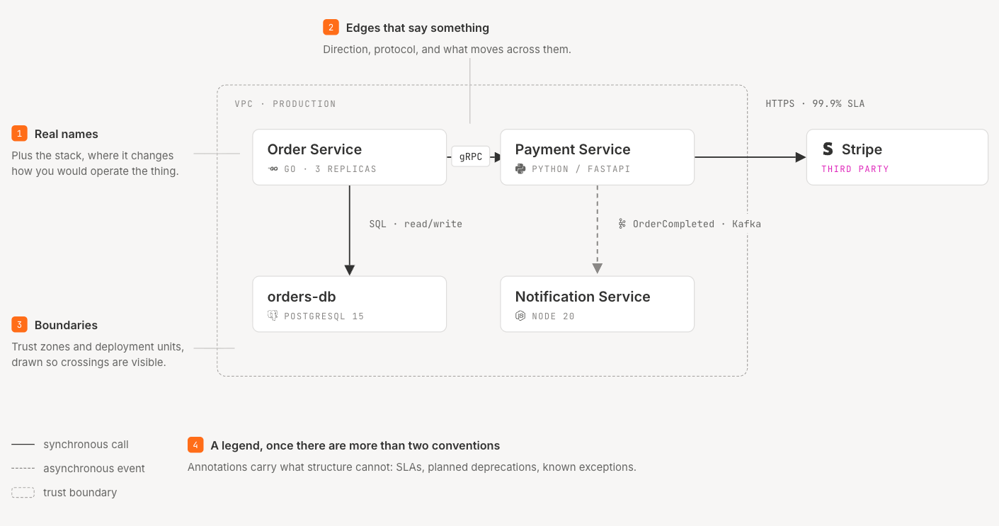
These key elements separate diagrams that communicate complex ideas from diagrams that create confusion.
Components and Services
Every box on your diagram should represent a distinct component with a clear responsibility. Label each one with its actual name, not a generic description, because "Order Service" tells a reader far more than "Microservice B." Including the technology stack where it matters, like "(Python/FastAPI)" or "(PostgreSQL 15)," also helps reviewers assess operational implications without digging into the codebase.
Connections and Data Flows
Lines between components should communicate direction (which component initiates), protocol (HTTP, gRPC, async message), and what data moves. A line from "Payment Service" to "Notification Service" labeled "OrderCompleted event via Kafka" gives a reviewer everything they need, whereas an unlabeled arrow between two boxes leaves too much open to interpretation.
Boundaries and Layers
Use visual boundaries to group related components: a dashed border around everything running in your VPC, a shaded region for your Kubernetes cluster, a clear line separating your public-facing services from internal ones. Boundaries communicate trust zones, deployment units, and organizational ownership.
Labels, Legends, and Annotations
Every diagram needs a legend if it uses more than two visual conventions (colors, line styles, shapes). Annotations are your opportunity to add context that the structure alone doesn't convey: "This connection has a 99.9% SLA" or "Planned deprecation Q3 2026." Don't force readers to guess what your visual conventions mean.
How to Create an Architecture Diagram
Define the Purpose and Audience
Before opening any diagramming tools, answer two questions: What decision does this diagram need to support? Who will read it?
A diagram for a design review with senior engineers needs component-level detail with technology choices and data flows. A diagram for a board presentation needs high-level service boundaries with business capability labels. Trying to serve both audiences with one diagram produces something that satisfies neither.
Identify Key Components and Relationships
Start by listing the major components and their relationships in the diagramming process. Don't open your visual tools yet. Write a text-based inventory: "Order Service calls Payment Service synchronously via gRPC. Payment Service publishes OrderPaid events to Kafka. Notification Service consumes OrderPaid events."
This text-first approach forces you to think about what belongs in the diagram before you start arranging boxes. It makes creating architecture diagrams easier and prevents the common trap of drawing first and thinking second.
Choose Your Notation and Tooling
Pick a notation that matches your audience's expectations. The C4 model works well for teams that want structured levels of detail without the overhead of full UML. PlantUML and Mermaid let you define diagrams as code, which integrates with version control workflows. For ad hoc whiteboard sessions, any consistent box-and-arrow convention works as long as your team agrees on what shapes and colors mean.
The tooling question matters too. Manual diagramming tools (draw.io, Lucidchart, Visio, Miro) offer intuitive tools with shape library support and architecture diagram templates, giving you full creative control but requiring manual updates when your architecture changes. Code-based tools (PlantUML, Mermaid, Structurizr) let you version your diagrams alongside your code in the software development workflow. And a newer category of tools auto-generates architecture models directly from your infrastructure. Catio's Archie, for example, connects directly to your infrastructure and maintains a real-time model of your architecture, so the "diagram" stays current without manual redrawing. It also lets you ask questions about your architecture in natural language: "What depends on this service?" or "What's the blast radius if this database goes down?"
Draw, Review, and Iterate
Your first draft will be wrong. That's fine. Share it with your development teams, walk through it in a review, and update it based on feedback. The value of a diagram lies less in its polish than in the shared understanding it creates through the process of building and reviewing it together.
Build iteration into your workflow. Set a calendar reminder to review critical architecture diagrams quarterly. Better yet, use tooling that keeps your diagrams synchronized with reality automatically so you're reviewing deviations, not redrawing from memory.
Architecture Diagram Best Practices
Keep It Simple: One Diagram Per Concern
One of the most common mistakes in architecture diagramming is trying to show everything in one diagram. A diagram that includes infrastructure, data flows, security boundaries, deployment topology, and runtime interactions is unreadable.
Follow the C4 model's principle of levels: start with a high-level context diagram, then create separate diagrams for containers, components, and code as needed. Each diagram answers one question well rather than answering five questions poorly.
Use Consistent Notation (C4, UML, or Your Own Standard)
Pick a notation and stick with it across your organization. It doesn't matter whether you use C4, UML, or a custom convention, as long as everyone on your team interprets the same shapes, colors, and line styles the same way.
Document your conventions. A simple legend page that says "blue boxes = our services, gray boxes = third-party, dashed lines = async, solid lines = sync" saves hours of confusion across design reviews. Pair consistent notation with strategic architecture recommendations and your diagrams become actionable, not just informational.
Keep Diagrams Alive: Static Diagrams Decay
This is where most architecture diagramming guidance stops. "Draw a good diagram" is useful advice, but it ignores the harder problem: keeping that diagram accurate over time.
Static diagrams decay at the speed of deployment. Every merged PR in the software development lifecycle that adds a service, changes a dependency, or modifies infrastructure configuration makes your existing diagrams slightly less accurate. After a few months of active development, the gap between your diagrams and your actual system becomes large enough to be dangerous. Teams make decisions based on outdated diagrams, miss critical dependencies during incident response, or waste hours in meetings debating what the current state actually looks like.
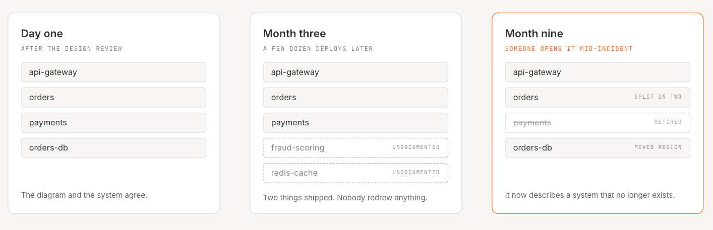
The solution isn't "update your diagrams more often," because that's a process problem disguised as an answer. What actually works is living documentation where tooling keeps architecture models synchronized with live infrastructure, similar to how infrastructure-as-code keeps provisioning in sync with version control. Catio's platform does exactly this: it connects directly to your infrastructure and maintains a real-time model of your architecture. When a new service appears in production or a dependency changes, the model reflects it automatically. No manual updates, no stale documentation.
Architecture Diagram Tools Compared
The architecture diagram tool landscape spans manual drawing tools, code-based generators, and infrastructure-aware platforms.
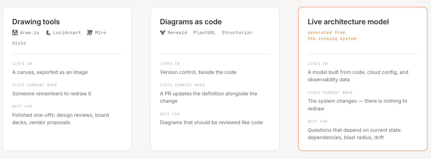
Whether you need an architecture diagram online tool for quick collaboration or a full architecture diagram software suite for enterprise governance, here's how the major options compare:
Traditional diagramming tools (draw.io, Lucidchart, Miro, Visio) work well for creating polished, presentation-ready diagrams. They give you complete control over layout and styling, but the trade-off is that every diagram becomes a manual artifact requiring human effort to keep current.
Code-based tools (PlantUML, Mermaid, Structurizr) solve the version control problem. Your diagrams live alongside your code and go through the same review process. But they still require someone to update the diagram definition when the architecture changes.
We take a different approach. Rather than asking you to draw or define your architecture, we connect directly to your infrastructure (AWS today) and auto-generate a live model. This means your architecture representation stays current on its own, and you can use Archie's AI-powered reasoning to ask questions about dependencies, blast radius, and optimization opportunities that static diagrams can't answer.
The Problem with Static Architecture Diagrams
Most organizations with more than a handful of services have experienced this: someone pulls up an architecture diagram during an incident, and within minutes, the team realizes the diagram doesn't reflect how the DevOps system currently operates. Maybe a service was added three months ago and never documented, or a database migration changed the data flow, or a dependency was deprecated but still appears in the diagram.
This isn't a discipline problem so much as a structural one. Keeping diagrams updated through manual maintenance requires continuous effort, and that effort competes with every other priority on an engineering team's plate. The result is predictable. Diagrams get created during initial design, presented once or twice, and then slowly diverge from reality until they're more misleading than helpful.
The cost of this drift is real. Architecture diagrams play a central role during incidents, and outdated ones lead teams down the wrong paths. During architecture reviews, decisions are made against inaccurate representations. During onboarding, new software development engineers build mental models based on documentation that doesn't match production. Keeping technical documentation current is a well-documented operational challenge, one that predates AI-assisted development and gets harder as the pace of change increases.
The emerging answer is infrastructure-aware architecture models, tools that derive their understanding of your system from the system itself rather than from a human's last memory of it. Our approach, connecting to your live infrastructure and maintaining a real-time model, addresses the drift problem at its source. When your architecture model is generated from your actual AWS environment, nothing goes stale. And because the model is live, it can power AI-driven analysis: identifying unused resources, flagging architectural risks, and generating data-driven recommendations for optimization.
Conclusion
Architecture diagrams remain one of the most effective visual tools in software development for communicating how complex systems work, identifying potential bottlenecks, and making informed technical decisions. The six diagram types covered here, from software architecture to data architecture, give teams the visual vocabulary to have precise conversations about complex ideas across the entire system.
But the hardest part of architecture diagramming isn't drawing the diagram; it's keeping it accurate as your system evolves. The efficiency the architecture diagrams bring to decision-making disappears when those diagrams no longer reflect reality. Teams that rely on static, manually maintained diagrams tend to struggle with drift, which is why live architecture models, the kind that stay synchronized with your actual infrastructure and power AI-driven reasoning about dependencies, risks, and optimization opportunities, are becoming the more durable option.
If you're ready to move beyond static diagrams and see what a live architecture model looks like for your environment, book a demo with Catio and see how Stacks auto-generates a real-time model of your technology estate.
FAQ
What is an architecture diagram? An architecture diagram is a visual representation of a software system's structure that shows components, their relationships, and data flows. Architecture diagrams help teams communicate design decisions, plan changes, and align stakeholders around a shared understanding of how a system works.
What are the types of architecture diagrams? The main types are software architecture diagrams (code structure), system architecture diagrams (software + infrastructure), application architecture diagrams (single-app focus), integration architecture diagrams (system-to-system connections), deployment architecture diagrams (where software runs), data architecture diagrams (data storage and flow), and specialized variants like devops architecture diagrams and cloud architecture diagrams for specific environments.
How do I create an architecture diagram? Start by defining the diagram's purpose and audience. List key components and their relationships in text before opening a tool. Choose a notation standard (C4 model, UML, or custom), create diagrams, and then review them with your team. Build in a process to keep them updated.
What tools can I use for architecture diagrams? Manual tools include draw.io, Lucidchart, Miro, and Visio. Code-based options include PlantUML, Mermaid, and Structurizr. For auto-generated, live architecture models, Catio connects to your infrastructure and maintains a current representation without manual drawing.
What is the difference between a system diagram and an architecture diagram? An architecture diagram focuses on software components and their design relationships. A system diagram is broader, including hardware, network infrastructure, and physical topology alongside software. A system architecture diagram combines both perspectives, showing how software maps to infrastructure.
Share this Post