August 15, 2026
Dependency Diagram: Types, Tools & How to Build One (2026)

A new engineer joins a payments team and asks the question every architect dreads: "What actually depends on this Postgres cluster?" Nobody knows. The Confluence diagram is eighteen months old, two services have been deprecated, and the original author has left. Engineering leaders, software architects, and platform teams need a way to visualize component relationships that stays accurate as the system changes. This guide explains what a dependency diagram is, the main types, how to draw or generate one, and the tools that make it possible.
What Is a Dependency Diagram?
A dependency diagram is a visual representation of the relationships between components in a system, where each node is a component (a service, module, task, or data field) and each edge shows that one component depends on another. In software, it maps which services call which APIs. In project management, it maps which tasks must finish before others can start. The structure is the same: nodes plus directed edges.
Dependency diagrams sit inside the broader architecture diagram patterns used by engineering teams, but they focus narrowly on the edges. Where a deployment diagram shows where things run, and a data flow diagram shows how data moves, a dependency diagram answers a single question: what needs what to function? Formally, the underlying object is what's known as a dependency graph, a directed graph representing dependencies among objects, which is the mathematical backbone the visual sits on top of. The C4 model, Microsoft's Visual Studio dependency tooling, and diagrams-as-code tools all apply the same basic graph concept at different levels of abstraction.
Types of Dependency Diagrams
The label gets attached to four distinct artifacts that solve different problems for different audiences. Understanding which one you need is half the battle.
Software and System Dependency Diagrams
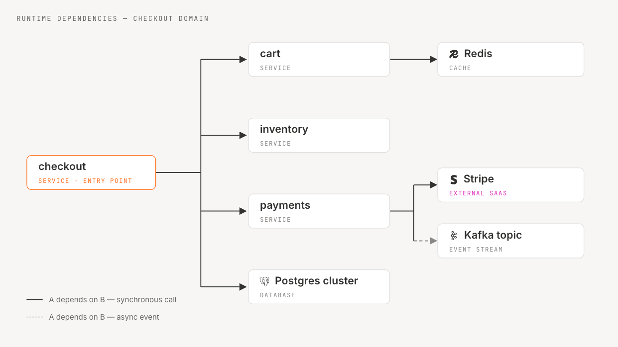
The modern architecture use case. Nodes are services, libraries, queues, databases, or third-party SaaS dependencies, and edges show runtime calls, build-time imports, or data dependencies. A typical example: a checkout service depends on cart, inventory, Stripe, and a Postgres cluster. When the inventory team plans a schema migration, this diagram tells them which downstream services need coordination.
Task and Project Dependency Diagrams
In project management, a dependency diagram is a Gantt chart cousin. Nodes are tasks ("design API", "build frontend", "deploy to staging"), and edges encode finish-to-start or start-to-start relationships. Teams use them to identify the critical path through a project plan and flag tasks that block release dates.
Functional Dependency Diagrams (DBMS)
In database design, functional dependency diagrams describe constraints where one set of attributes determines another. If student_id → student_name, then student_id functionally determines student_name, and database designers use those relationships to reason about normalization on the way to 1NF, 2NF, and 3NF.
Component and Module Dependency Diagrams
Object-oriented and modular codebases produce a fourth flavor: diagrams of how classes, modules, packages, or layers depend on each other. IDEs and static analysis tools generate these from source, and engineers use them to detect circular dependencies and layering violations.
When and Why Engineering Teams Use Dependency Diagrams
Dependency diagrams earn their keep when a team needs to reason about change. The five highest-value use cases come up again and again in conversations with platform engineers and architects.
- Impact analysis and blast-radius estimation. Before deprecating a service or rotating a database credential, you need to know what breaks.
- Refactoring and modernization planning. When a monolith is being decomposed, the dependency graph reveals seams and ordering constraints. Tightly coupled clusters often signal the wrong service boundaries.
- Incident response. During an outage, an up-to-date dependency view shortens the path from alert to root cause.
- Compliance and audit. Regulated industries need to demonstrate which systems touch sensitive data, and a dependency diagram is often the simplest format auditors accept.
- Onboarding. New engineers spend days reverse-engineering a codebase, and a current diagram can cut that to hours.
These use cases share one requirement: the diagram has to be accurate. A diagram reflecting last quarter's architecture can be worse than no diagram, because it gives false confidence. Teams running modernization efforts pair dependency mapping with application portfolio management so the visualization is grounded in a real inventory of systems, owners, and lifecycle status.
Anatomy of a Dependency Diagram
Every dependency diagram, whether hand-drawn on a whiteboard or automatically generated from a live architecture model, is built from the same primitives. Knowing the vocabulary makes it easier to read someone else's diagram and to design your own.
Nodes represent components: services, databases, queues, libraries, or external APIs. Edges represent the dependency itself, and a directed edge from A to B means A depends on B. Edge direction matters, because reversing the arrow changes the meaning entirely. Edge metadata is where the most useful detail lives: protocol (HTTP, gRPC, async), criticality (hard versus soft dependency), and frequency.
A useful diagram also distinguishes between directed acyclic graphs (DAGs) and cyclic graphs. Build systems and task plans are usually intended to be DAGs; cycles generally indicate an invalid plan or a dependency problem. Runtime service graphs in production are sometimes cyclic, and those cycles are often the bugs you most want to find.
Common notations include:
For most production work, a C4 component diagram with edge metadata is enough structure without becoming academic.
How to Draw a Dependency Diagram (Step-by-Step)
There are three paths to a dependency diagram: draw it manually, generate it from code, or generate it from the live system. Each fits a different situation.
1. Identify the components. Decide on the level of abstraction first. Are you drawing services, modules, classes, or tasks? Mixing levels is one of the most common reasons diagrams become unreadable.
2. Catalog the dependencies. For each component, list what it depends on. In manual mode this means interviewing engineers and reading code. In code-generated mode a tool parses imports, references, and project files. In automated mode, a platform listens to live signals and infers the edges.
3. Choose a notation. Block-and-arrow for whiteboards, C4 for architecture reviews, UML for class-level work, Mermaid or Graphviz when you want the diagram to live in source control alongside the code.
4. Draw the diagram. This is the step everyone obsesses over, and usually the one where the least value gets created. If you are drawing manually, use grid snapping and consistent shapes. If you are generating, layout is the tool's job.
5. Validate against reality. Walk through the diagram with the engineers who own each component and ask what is missing. Implicit dependencies (a shared cache, a message bus, a feature flag service) are the ones manual diagrams almost always omit. Microsoft documents the code-generated path, where Visual Studio can create dependency diagrams from your code by analyzing project structure.
A worked example: checkout depends on cart, inventory, payments, and Postgres. Cart depends on Redis. Payments depends on Stripe and a Kafka topic. Drawing this takes ten minutes; keeping it accurate over six releases is the hard part.
Manual vs Automated Dependency Diagrams
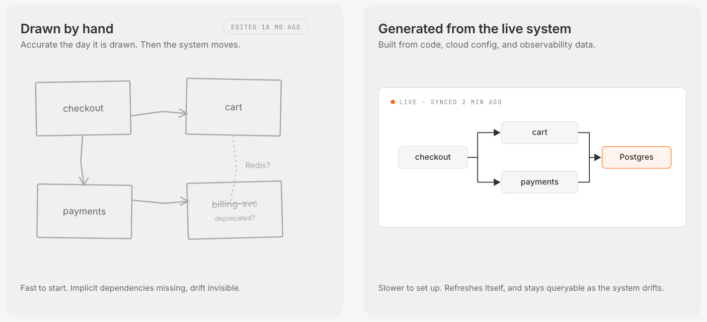
The tradeoff: manual diagrams are fast to start and slow to maintain. Automated diagrams are slower to set up but much cheaper to refresh, because most updates come from connected systems instead of manual redraws. Whether the tradeoff is worth it depends on how often your architecture changes.
Manual diagrams still have a place. Use them for ADRs, design reviews, onboarding sessions, and explaining intent to a non-technical audience. Use generated diagrams when the question depends on current-state accuracy, such as impact analysis, incident response, or audit evidence. Most teams need both.
We sit in the third category. Our live architecture model is built from your code, cloud config, and observability data, and auto-generates dependency diagrams from that model inside Stacks. Archie, our conversational reasoning agent, lets engineers ask natural-language questions like "what depends on this Postgres cluster?" without redrawing anything. The diagram becomes an output of the connected model rather than a separate artifact someone has to redraw after every release.
This is not a recommendation to throw away drawing tools. For a one-off slide or an ADR, a static drawing is fine. For anything that has to stay accurate across releases, automation is usually the better default.
Top Tools for Creating Dependency Diagrams
The tooling landscape splits roughly into three buckets: general-purpose drawing tools, code-aware tools that parse repos, and live-architecture platforms that derive diagrams from running systems. A short, opinionated map:
General-purpose drawing tools. Lucidchart, draw.io (diagrams.net), Gliffy, Microsoft Visio, and EdrawMax all let you place shapes and arrows on a canvas. They are best for static diagrams: architecture review slides, vendor proposals, certification documents.
Code-aware tools. JetBrains IDEs and ReSharper render module and project dependency graphs from source. Microsoft Visual Studio generates dependency diagrams directly from .NET code. Static analysis tools like NDepend, jdeps for Java, and Madge for JavaScript produce similar output by walking imports. These work best at the module and package level inside a single repository.
Live-architecture platforms. We build a live model of the running system and automatically generate dependency diagrams across services, infrastructure, third-party SaaS, and data flows. This covers ground the first two categories generally don't reach: runtime calls between microservices and external SaaS dependencies.
A practical rule of thumb: if you draw a dependency diagram more than twice for the same area of the system, the diagram should probably be generated from now on. For a wider survey of the category, see this overview of software architecture tools.
Dependency Diagrams in Modern Architecture Workflows
Dependency diagrams used to be artifacts: PNGs in a Confluence page, PDFs in a compliance binder. In modern workflows, they are interfaces. Engineers query them, and the answer is whatever the system actually looks like right now.
This shift matters because architectures change faster than humans can redraw them. A microservices estate with dozens of services and weekly deployments can produce enough dependency changes per quarter that manual diagram maintenance becomes unrealistic, and no team realistically keeps a hand-drawn diagram aligned with that drift. Our Loop, the five-stage cycle of Understand, Decide, Design, Execute, and Compound, treats the dependency view as the "Understand" step, with the diagram as input to architecture conversations rather than output.
Engineering leaders investing in architecture visibility use the dependency view for three workflows: pre-change impact analysis, incident response, and modernization planning. The value is the same in all three: the diagram is more current, easier to verify, and queryable.
Common Mistakes to Avoid
A few patterns show up across teams that try to maintain dependency diagrams manually. Each one is fixable, but only if you see it coming.
- Stale diagrams. A diagram more than a couple of releases old should be treated as historical evidence, not current truth. Undated diagrams need especially careful review.
- Missing implicit dependencies. Shared caches, feature-flag services, identity providers, and DNS rarely appear in hand-drawn diagrams, yet they are often the actual blast radius of an outage.
- Conflating runtime and build-time dependencies. A library import is build-time; a network call is runtime. Mixing them makes both harder to reason about.
- Omitting external SaaS. If your service depends on Stripe, Twilio, or Auth0, that vendor belongs on the diagram.
- Over-detailing. A diagram with eighty nodes is a heat map. Pick an abstraction level and prune.
Conclusion
A dependency diagram is only as useful as it is accurate. Hand-drawn diagrams have their place on whiteboards, in slides, and in one-off architecture reviews. For production architectures that change weekly, the diagram needs to live as close to the running system as the running system itself, generated from real signals and queried like any other piece of infrastructure data.
Ready to see what your architecture actually looks like right now? Book a demo and see how we generate live dependency diagrams from your real architecture.
Frequently Asked Questions
What is a dependency diagram? A dependency diagram is a visual model of which components in a system depend on which other components, drawn as nodes connected by directed edges. In software, components are services or modules; in project management, they are tasks; in databases, they are attributes inside a table.
What is a dependency structure? The dependency structure of a system is the underlying graph of dependencies, independent of how it is drawn. The same structure can be expressed as a diagram, an adjacency list, a matrix, or a queryable graph database.
What is the difference between a dependency diagram and a dependency graph? A dependency graph is the underlying directed-graph structure: nodes, edges, and direction. A dependency diagram is one visual representation of that graph, drawn for human readers. Tools and queries work against the graph; people work against the diagram. A platform that maintains a current graph can render multiple diagrams from it (service-level, team-level, data-flow-level) without redrawing anything.
What are the four main types of dependency diagrams? Software and system (services and modules), task or project (PM and Gantt), functional (database normalization), and component or module (OOP and code-level).
How do you create a dependency chart? Identify components, catalog their dependencies, choose a notation, draw or generate the diagram, then validate with the engineers who own each component. For production architectures, generate from a live source rather than draw from memory.
Share this Post