September 16, 2026
The System Overview Diagram: What to Include (and What to Leave Out)

A system overview diagram is the picture you hand someone who needs to understand one system quickly: its major components, the things outside it that it talks to, and which direction the data moves. You draw it for a new engineer, for a design review, or at two in the morning when something is broken, and nobody can remember what depends on what.
It is also one of the hardest diagrams to scope. Keep it simple and avoid unnecessary detail is advice you will read everywhere. This guide gives a stopping rule, identifies which diagram owns each thing you cut, and explains how to keep the result current.
What a System Overview Diagram Is, and What It Is Not
One system, seen from just outside it. Enough internal structure that a reader can name the major moving parts, plus the external systems and data stores it depends on, and the direction of flow between them. That is the whole brief.
It helps to place it against the diagram types on either side. Zoom out, and you get an application landscape view of the whole estate, closer to application portfolio management or the wider IT architecture picture than to anything at this altitude.
Zoom in, and you get component or class-level diagrams describing how one part of the system architecture is built internally.
The C4 model is the most useful reference point, and it pays to be precise about the relationship. C4 has no level called a system overview. Its named diagrams run from system context, through containers, down to components and code, with a system landscape view above them for the whole estate. What most people draw as a system overview lands between the first two, borrowing external context from the level that deliberately excludes technology and internal structure from the one that deliberately includes it. It borrows from two carefully defined levels and is not defined by either.
For the underlying theory of how any of these pictures communicate, our piece on the art and science of architecture diagrams covers graphs, hierarchy, and layout properly.
Who Actually Reads One
Four audiences want the same thing for different reasons. A new engineer needs a map before the codebase means anything. An architect in a design review needs to see what a proposed change touches. An incident responder needs to know what sits upstream of the failure. A principal engineer scoping a modernization needs the dependency shape before estimating.
None of them are reading for detail. They read to orient, then go look at something specific. That is the test every element has to pass.
What to Include
Include five things, and the fifth is the one people forget.
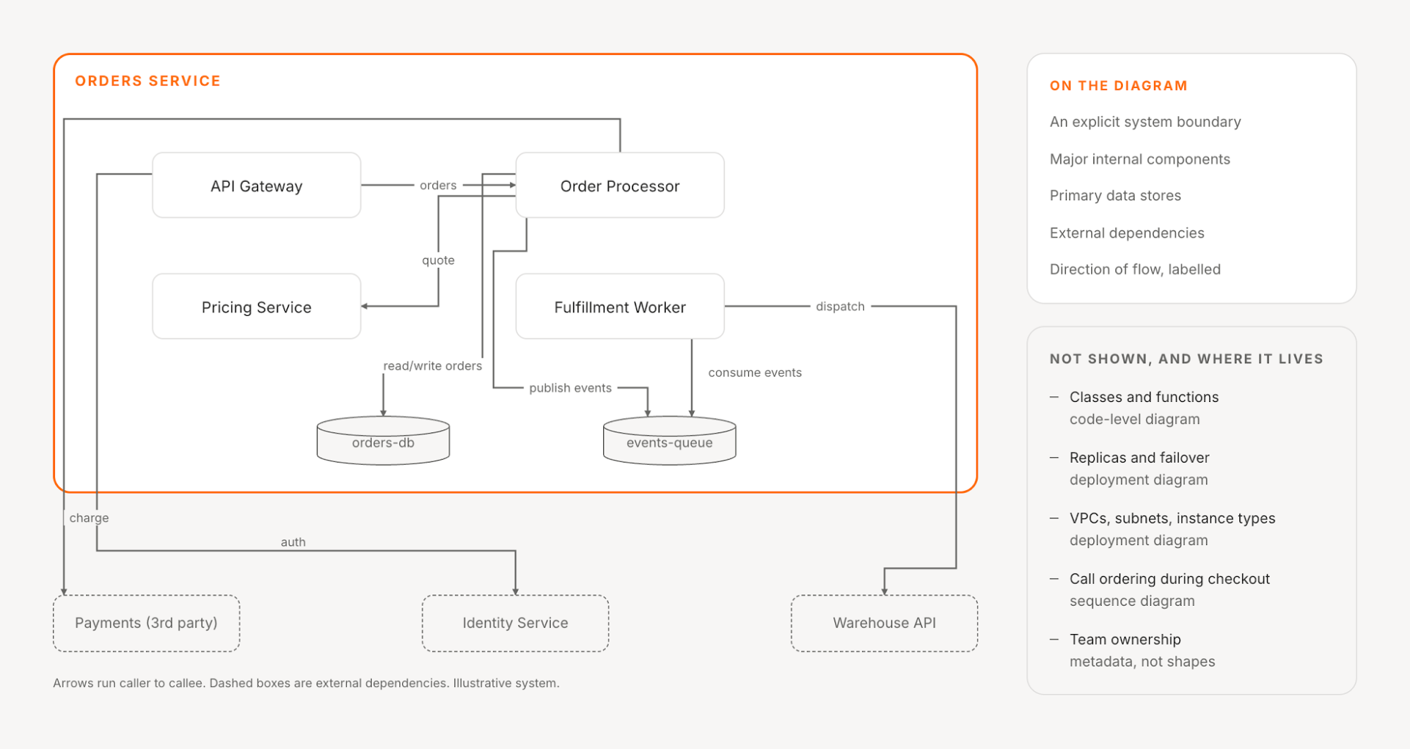
The system boundary. Draw it explicitly: a box, a shaded region, something. Half the confusion about these diagrams comes from a reader not knowing which items are yours and which are someone else’s.
The major internal components. Services, applications, workers, jobs. Something belongs here if a reader needs to know it exists to reason about a change, and anything deployed and owned independently usually qualifies.
Primary data stores. The databases, caches, queues, and buckets the system depends on, attached to the components that use them. Not schemas, not table counts, not instance classes.
External dependencies. The systems outside the boundary that this one calls or is called by, including third-party APIs and internal services owned by other teams. Mark them so the difference is visible without guessing: a dashed border is enough, as long as a one-line key or caption says that dashed means external. These are the elements most often missing from a hand-drawn diagram, because they arrive in a pull request nobody redrew.
Direction of flow. Arrows that mean something. A line between two boxes tells the reader they are connected, which they probably guessed. Decide what an arrow means before drawing the first one, because the same shape reads as a dependency, a control relationship, or a data flow. Our convention is direction of initiation: the caller points at the callee. Keep every relationship unidirectional and labeled with what it carries, and if either component independently initiates calls, draw two labeled arrows rather than one line with two heads.
The Checklist
Copy this into the ticket where the diagram gets drawn:
- One named reader and one named moment, written at the top
- An explicit system boundary
- Major internal components, all at the same altitude
- Primary data stores, attached to the components that use them
- External dependencies, visually distinct, with a key for the distinction
- One stated meaning for an arrow, applied consistently to every labeled, unidirectional relationship
- No element that fails the stopping rule below
- A named owner and a plan for keeping it current
Where to Stop
The standard advice is to avoid unnecessary detail, which is not advice, because “unnecessary” is doing all the work in that sentence and nobody defines it. It is not even settled: for some audiences the right answer is more interaction detail rather than less. Both positions are defensible for some diagram, but neither is a stopping rule for this one.
The stopping rule: cut anything that does not change which component a reader would open next. A system overview diagram is a navigation aid. Its job is to get someone to the right place, not to answer the question they will ask once they arrive. If an element only pays off after the reader has already found what they were looking for, it belongs one level down.
Applied honestly, that rule cuts five things, and each has a home elsewhere.
Code-level structure. Classes and functions belong in a code-level diagram, which most teams generate on demand rather than maintain. Module boundaries inside one component belong in a component diagram.
Replicas, instances, and scaling topology. Three boxes for three instances of the same service tell the reader nothing they can act on. Clustering, replication, and failover vary by environment, which is what a per-environment deployment diagram is for.
Deployment and infrastructure specifics. VPCs, subnets, instance types, routing. The line against the data stores above is worth stating, since a cache and a load balancer look like the same kind of object. A reader chasing a bug opens the service that writes to the cache, so the cache changes where they look. Omit load balancers, ingress, and TLS termination by default, and include one when the audience’s question depends on it: an incident responder chasing a failing health check is looking at exactly that box.
Call sequences and timing. If the interesting thing is the order in which five services talk during checkout, that ordering belongs in a sequence or dynamic diagram. Adding it here would overload an overview whose job is orientation.
Ownership and team structure. An admitted exception, worth saying so rather than pretending the rule is cleaner than it is. For an incident responder, whose team owns a component does change where they look next, so it passes the rule. Put it in metadata attached to components anyway, not in the shapes, because ownership changes on a different clock from architecture.
One more constraint sits outside the rule entirely: anything you cannot keep current. That is a maintenance test rather than a reader test, and it has no home in another diagram type, because the problem is not altitude. The maintenance problem is covered below.
If you are choosing between formats more broadly, our guide to types of architecture diagrams covers what each one is for.
A Framework for Scoping One
Four steps, in order, because each narrows the next.
- Name the reader and the moment. Not “the team.” Something like “an engineer joining next month” or “a reviewer deciding whether this change is risky.” A diagram scoped for everyone is scoped for nobody.
- Draw the boundary before anything else. Decide what is inside this system and what is outside it. Every later argument about whether something belongs is really an argument about this line, so settle it first.
- List components at one consistent altitude. Write them out before drawing. If the list mixes a service, a library, and a function, the altitude is wrong, and the diagram reads as noise.
- Add flows, then cut. Draw the connections, then apply the stopping rule to every element and every line. If you cannot say where an element would send a reader next, remove it.
Step four is the one that gets skipped, and the only one that improves the diagram rather than filling it.
Common Ways These Go Wrong
Mixed abstraction levels. Hard to see in your own work: some boxes are services, one is a database table, one is a background function somebody happened to be thinking about. The fix is the list in step three.
A diagram of the intended design. Drawn during planning, describing what the team meant to build, never reconciled against what shipped. It becomes wrong quietly, which is worse than being wrong loudly.
Unlabeled lines. A picture whose lines have no direction and no meaning forces the reader to ask the exact question the diagram existed to answer.
A diagram nobody updates. The general case of the second, and the reason for the next section.
Why the Hand-Drawn Version Goes Stale
The failure mode is worth naming precisely. A drawn diagram is accurate on the day it is made. After that, its accuracy depends on somebody remembering to redraw it after a change they may not have made themselves. Nothing signals that this has stopped happening, and the diagram renders as confidently at month eighteen as on day one. A hand-drawn diagram records what someone believed on the day they drew it, and it starts drifting the moment it is saved, which is why we derive ours instead. The general problem is configuration drift.
The alternative is to derive the view from the systems, which is why we built Stacks. It is not a diagramming tool. It is our live model of your architecture as it actually runs, mapping your subscribed integrations into a model with no manual modeling step.
What makes that relevant is not that it draws the picture for you, and a derived view starts from the opposite end of this article’s advice. The Infrastructure View begins with everything: your entire infrastructure at a glance, useful for a high-level picture and noisy the moment you want to focus on a specific area. That is the failure mode this piece has spent five sections warning about, arriving by a different route.
What changes is what the stopping rule decides. On a drawing, the cut is permanent and invisible, because the reader cannot tell what was removed or why. On a derived view, the rule becomes a decision about the default state, implemented by Filter, which shows or hides specific component types or tags. Same operation, applied to a view instead of a canvas.
Focus is a different move and should not be confused with the rule. It keeps the surrounding context visible but dims everything outside your selection, so you do not lose spatial orientation. That is de-emphasis rather than exclusion, useful when you need to narrow attention during an incident without losing your bearings. It does not replace the judgment about what belongs in the default picture.
The other half of the orientation problem is what happens after the reader finds the box they care about. From the view, you can open a component and get its details and its relationships. That is where the architecture inventory picks up, one level below what the picture shows. It does not carry everything the stopping rule cut, and ownership in particular stays wherever your team already records it. Archie, our conversational layer over the same model, is where the follow-up usually gets asked, because “what depends on this database” is easier to type than to trace by eye.
Coverage needs an explicit check. Our analysis is bounded by the connected sources and context you provide; infrastructure integrations are read-only, so coverage is bounded by what you have connected. We work with architecture teams beyond AWS-only estates; the available integrations and evidence coverage need to be confirmed for your environment.
Conclusion
A system overview diagram is a scoping decision that happens to produce a picture. Almost all the value is in what you decided not to draw, and that is the part the usual advice leaves to instinct.
So use the rule: cut anything that does not change which component a reader would open next, and know which diagram owns each thing you cut. Then ask what will keep the picture true after the third release. If the honest answer is that somebody would have to remember, that is worth knowing before you spend an afternoon drawing it. Seeing the view generated from a real environment instead is what our platform is built for.
Book a demo to explore a system view built from your connected AWS environment.
Share this Post